This is a classic CD label that most people would recognize, But the typography is terrible. The near comic sans font mixed with the horrifying black stroke... it's like Willie's nightmare! I like the moon picture and the infamous prism, but the type is baaaaad.
This is a really cool idea. I like how the audio wavelengths of each song are displayed. However, why isn't it spaced to fill the back. Or used another element of the design. it just leaves this awkward negative space that throws off thr design. Weird.
I love the design of this label. I'm a huge fan of negative space if its used properly. The name of the record balances the symbol really well, and the color scheme seems to match the font used really well also. Its a very very simple design, but I think it works perfectly.
Fantastic play on words here. Its punny really. But seriously, the design is great. The way the font is made out of quilt colors and you can see the left over string is a great thought. I also like the color of the background. I think that tan-brown color pulls together the whole piece. Good, ironic design!
This design isn't bad. Its meant to look like the classic black and white title and i think it pulls that look off really well. The font that is really full of serifs and the 3D style stroke is perfect. Plus, the slight gran on the design really pulls it together. The border and text decor is all really well done. Not the most original idea, but they pulled off the classic look really well.
This is some very interesting photography on display here. I think it is suppose to be a moon made from some sort of fog or an upside down sky that we see through the trees. Its very strange and I'm not sure i like it. I love the broken font in the title and i like how small it is. But the overall aesthetic it just too far fetched for me.
I think this is disgusting. Every bit of it. The font is ugly has no readability, the weird dotted line is out of place and doesn't fit in the design, and the puke green ring around the design makes everything look even worse. All bad. No good... At all.
This is kind of trippy but really interesting. It really hold your attention. I like how the whole illustration is black and white, but the name is colorful, although the graphic behind the name is really out of place and almost throws it all off. But other than that i think its a cool and interesting abstraction of the sea and sky, and it keeps the viewer guessing and interested.
This is an okay design. Its just a plain old autobiographical album cover with some awful 80's clothes and graphics and a strange color scheme. You would think it would be opposite and the woman would be in color to draw your attention to her. Right know she just kind of hides in the background. No the biggest fan of this one.
This is kind of great, to be honest. Its very energetic and exciting. The repeating shape of the figure rocking out really stands out from the plain gray background, and the way they overlap draw your eyes in to try and figure out what is going on. Its like peacefully chaotic. (that would be a good band name.... syke.) Anyway, I like this and i think the messy font pits perfectly with the energetic design. Coooooool!
This is interesting. I love how the band name is like a stencil in the cover and the same color is used for the CD label. I also think they somewhat algebraic and spacey design fits perfectly with the design of the Band name. The spacing is clean in both designs and the space cloud as a background isn't too much to where it takes away from the name, and its not too little to where it is visually boring. Nice.
This illustration is perfect for the name of the album. If i were to imagine an iron sea i would picture pissed off raging horse waves. haha. But seriously, i think this is super creative and really well put together. And having the album name in the negative space in the top corner pulls it all together. Great album cover. Creative, simple layering and a clean, relative font.
Ehhhhh... Im on the fence. I love the band so i think it makes me want to like this, but its so centered and something is just off. Writing All This in the sand is a great idea but it is just too different from the rest of the design. The classy black and white car and the clean, all caps sans-serif font is great, but then we have pointless quotation marks and a Halloween, creepy style "All This." It could really be better.
I love this design. It is literally the simplest design possible (aside from maybe the Beatles White album) and it is still so visually interesting and perfect. The 4 main shapes lined up to spell love, with a white back drop, that's it! Simple, just like the music.
This design is interesting, but im not sure if i like it or not. It is extremely simple and made to look like it was hand written on a piece of paper, which it probably was. The simple handwritten note-like font fits the style of music on the album very well, but im not sure if its too simple.
This is a pretty cool CD cover. The illustration is incredible. There is so much going on, yet its not too messy or noisy. I think the font works perfectly with the design and the design fits the record style. Fun design.
This design is simple, but it has some problems. First, you lose some of the song titles in the white clouds. Also, i hate that the bar code is squeezed all the way up against the the corner with no breathing space. Other than that the photo is interesting and humorous and works well with the font choice.
I love this back label. I know and love this band, so i know that this antique building and window sums up the style and sound of the band really well. I also like how they played on the shape of the bricks to make the song listing. Not a fan of the 3 or 4 different fonts, but other than that the design is great and simple.
Not the most creative CD design. It looks like they just took the case design and just shrunk it down and put it on the CD. it doesn't look bad, accept for the awful black glow around the title, but i think they just took the lazy way out here.
This label was a great idea but its got some issues. If you've seen the movie you'll know the the cracked face photo is genius, but the typography is randomly placed and unorganized. I like the font, it is mysterious and creepy, but i do not like how the text is laid out. The actors names are left align, the title is almost right align but not really, and the text at the bottom is centered. no good.
Eh. Kind of unoriginal. The effected guitar photo, the cheesy hand written font, its all been done. I really don't like the idea. It seems kind of BSed. Not a fan.
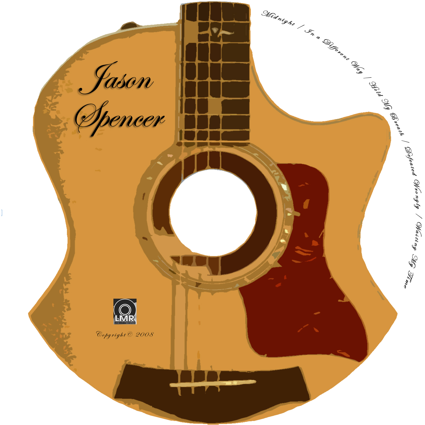
This design isn't the best, but it works. I like the messy, hand painted guitar in the middle and the CD hole is the hole of the guitar. I also like the negative space. It pulls the piece together very well. However, i do not like the Band name wrapped around the label. I understand the name is very long, but its hard, and annoying to read. Other than that its pretty good.
I like this design. Everyone knows who Elvis is, so just using his name as the whole design is great. Just the word Elvis in that classy 80's font makes you see him, hear him, and sing his songs. Simple, but genius. This was made by BMG Records.
This CD label is pretty good. The font works well with the mood and the romantic color scheme. The jumping dolphins are extremely cheesy, but it works. I also like how the text flows off of the label. The squares are awful, however. They don't fit with the rest of design at all. But, good design overall
This kiosk is fantastic. the design is so sleek and modern it just is begging to be touched. Everything from the simple sans-serif font, to the slight gradient in the background and the buttons, to the elegant faded floral design in the background and the title. The whole menu flows perfectly, it has great balance, each aspect relates well to one another, it is just all around well done. It is a great use of negative space as well. A+
This layout isn't the best. It's very plain and simple with nothing to catch your eye. The lower case font on the keyboard is so basic. I also don't like how the keyboard is semi-translucent. It creates way too much noise and chaos and the keyboard lettering gets totally lost. Definitely needs some work on this page.
This is a very fun idea for a burger restaurant. It's like build your own burger, literally! You pick the burger template, the toppings, the condiments and the number of patties. Great idea to attract more customers and make sandwiches more customizable. Plus it looks pretty fun.
Applebees let's you order from the table and play games while you wait. I've used this kiosk and it is incredible. You can pay 0.99 cents to play a game, order your food, pay your bill, call for a waiter or waitress and browse the desserts. It simply makes the dine in experience a little quicker and easier. The only negative is the waitress will probably not exist in the future because this little kiosk will take their jobs. But, the design is very visually appealing and modern and is a great technology... for now.
A program that let's one create their own system to turn their ipad or iphone into a kiosk. An app inside a kiosk inside a ipad inside a kiosk. Kiosk inception!
This is the type of kiosk the we will probably see everywhere within the next few years. It is extremely simple, but it gets the job done. You choice the department, then the name or room number you are looking for. It makes navigating huge business buildings much easier. The kiosks navigation and buttons look very easy to use, which is the most important thing. Simple, but effective.
This is another directional kiosk. I know i would use this. Subway systems are so extremely confusing. More people would be willing to use public transportation of they could figure out how to get where they need to go efficiently. The design is simple and easy to use. Just pick where you need to go and the kiosk displays an exact route and the stops you need to make. A long over due technology.
Don't have cash to put in the tithing envelope at church? No problem with this digital tithing machine that works like a smart ATM. It allows you to tithe any amount on money from your favorite credit card or debit card. It also allows you to print and weekly, monthly, or yearly spreadsheet of how much money you will tithe. Great technology to keep up with our very plastic paying world. I feel like more people would give to their church if they could swipe their card. This is a great idea to raise money.
This kiosk is genius. How often to people go to a big mall like columbia mall and get lost because they cannot find the store they are looking for? All the time! This kiosk allows you to search through the mall store directory, and when you pick one, it shows you a direct path on how to get to that specific store. So simple, but very effective and very needed.
I have actually used this kiosk at the Westminster Walmart. It is a great technology and works extremely well. The kiosk lets you stand on a sensor to figure out where the "hot spots" are on your feet, and then matches your results to one of the color coded gel in-souls for your shoes. The idea is kind of dirty because you take off your shoes and stand on the foot sensors... That's a lot of shoeless dirty walmart feet. So maybe if they made, disposable covers to place on the sensors, more people would use the technology. But, nevertheless i like the kiosk design, and the safety poles. it's a very unique technology, and works very well. Good stuff!
With the downloaded app you scan the barcode of whatever product you want to add it to your cart and have it sent to your house. The kiosk is made for airports and possibly places like doctors offices or car care shops so you can shop for necessities while you are waiting for other services. This technology is incredible and so futuristic. Its honestly a very simple kiosk, you just search or scroll through the products. The real technology is on the smart phone app that allows you to scan the product barcode. The kiosk itself is very simple but very effective. Very well done.
This is a cool idea of a kiosk. I love how wide it is so multiple different people can see and use the kiosk at the same time. This one let's you discover points of interest and information about your destination city. A great idea that gives flyers something to do and something to pass time while waiting for their flight. Plus it helps give vacationers something to look forward to when they get to their destination. I also like the font choice and the giant, wide layout. Good work, and an even better idea.
This song is so energetic and free it would be great for the ending of my project 1 video. And the break down (2:50) could work for the beginning. I would just flip the order of the song. Anyway, when i first heard this song, i fell in love with the intro. The drums and the quick keyboard riff are so intense, but still organized and attractive. I also like how that energy is carried through the entire song with keyboard riffs and great drumming. Very well done from the indie rock band Walk the Moon.
Im posting this acoustic version of John Mayer's, Queen of California because i like the intro guitar riff and i think it would fit well as the audio for my video. It is up-beat, but somewhat calming. It has a nice flow and sound, and my video has quick shot changes and camera jumps, so i think they would mash well together.
During Project 1, i actually added audio because i didn't know we weren't suppose to. When i first started looking for audio this was the first song that popped into my head. It is perfect for the build-up of my video. It starts with a simple, yet extremely catchy piano riff, and then a tom drum fill comes in, which is completed by the simple distorted guitar, which plays the melody line of the songs chorus. The instrumental (which is all we are using for project 2) in this song is great. It's up-beat and energetic, yet it is somewhat calming and easy to listen to. Very well done. The song was written and preformed by Jack's Mannequin.
This was one of the favorite super bowl commercials this year. Since it is new and fresh I wanted to see what the audio was in respect to project 2. The commercial is an advertisement for Radio Shack and how they have completely revamped their stores by making celebrites from the 80s come and steal all their stuff back. The audio used was a classic rock hit from the 80s which only made sense. I thought the chaotic rock song was perfect to help give the old and warn out feeling as the celebrities raided the store. It was honestly perfect. Very hilarious and a good sound track to back it up.
This was a hilarious stop motion. It was obvious the movie was made by 2 random guys, which is why I picked it. Aside from some lighting issues, the short was very very well shot. Extremely creative and entertaining. I really enjoyed this one. The video was created by Simon Lachapelle, a youtuber with a lot of technology and graphics related posts and videos.
I decided to critique the first community college promo video I found. So, I came across this one for Northhampton Community college, and I was so far from impressed. The video set up was so cliche and basic. Random reals of projects and awful interviews with random professors. Theres no creativity or uniqueness. The video was created by the Northhampton college communications program. It was just lacking quality and the spark that keeps your interest.
I picked this video because it is a professional stop motion animation done with Legos. Although I know that I can not produce something of this quality because it involves a lot of computer animation as well as stop motion, it was still cool to see what can be done professionally with this tool. Obviously, because it is professional quality there is not much I can critique. The stop motion animation is A+ and the plot looks hilarious, as well as the character development of all the superheroes. I wish I knew how they made some of the characters fly and such. Do they just use fishing wire or invisible line? All stuff to look into. The storywas written by Dan Hageman, Kevin Hageman, and Phil Lord, who also worked on blockbusters like 21 Jump Street and cloudy with a chance of Meatballs. although the film was written for children I am actually excited to see it because it looks hilarious and I'd love to see some of the techniques of making a stop motion.
I decide to post this video because it gave me some good ideas and contained a lot of the same simple stop motion effects that i was planning to use in the first project. For example, the motionless walking, the flying effect, etc. It's all rookie stop motion stuff, but I believe that's the level of product i will be able to produce. That being said, the video was pretty well done. A decent, but random plot, and very good camera work (minimal shaking, not too jumpy). My only issue is it wasn't very creative, and some of the effects were really random and somewhat pointless, and took away from the video. But, all in all, it was well done to say the least. The creator of the video is just a miscellaneous youtuber, no real background or prevalence.
This is a Promotional commercial for Ellsworth Community College. To be honest, it is just awful. It was the first video for a community college that I came across. I wish I hadn't. Pointless shots, confusing transitions, and possibly the worst jingle at the end of the video. Maybe I'm being harsh, but I all I learned was two mediocre statistics about the college. The video was made by Iowa-Valley Community College District. They have other college promo videos that are of a much better standard, so I'm not sure why this one was so poor. I choose this video because it has to do with the college promo we have to make, but instead of giving me positive ideas, now I just know what not to do when I create my promotional video.
This is a fantastic example of stop motion shot with a Nokia N8 by Sumo Science on Pendine Beach in South Wales. Sumo Science is a two-man animation team. They are a huge success online with almost five million hits on their website and winners of the 2011 Young Director Award. I enjoy this video because it is so unique. Stop motion has an endless amount of possibilities, so when I see a creative, unique stop motion, that isn't just legos or action figures, I am immediately drawn in. Plus, the storyline is extremely fun and creative so I was interested and drawn in the entire time. This relates to our first project because I plan to utilize stop motion to advertise Carroll Community.